I documented the entire schematic design portion of this house on Twitch, hence the name. Most of the videos are down now, but I’ve saved them and plan to distill them into YouTube content.
The site itself asks for the area to be distributed across three stories, despite being only 1,400 square feet.
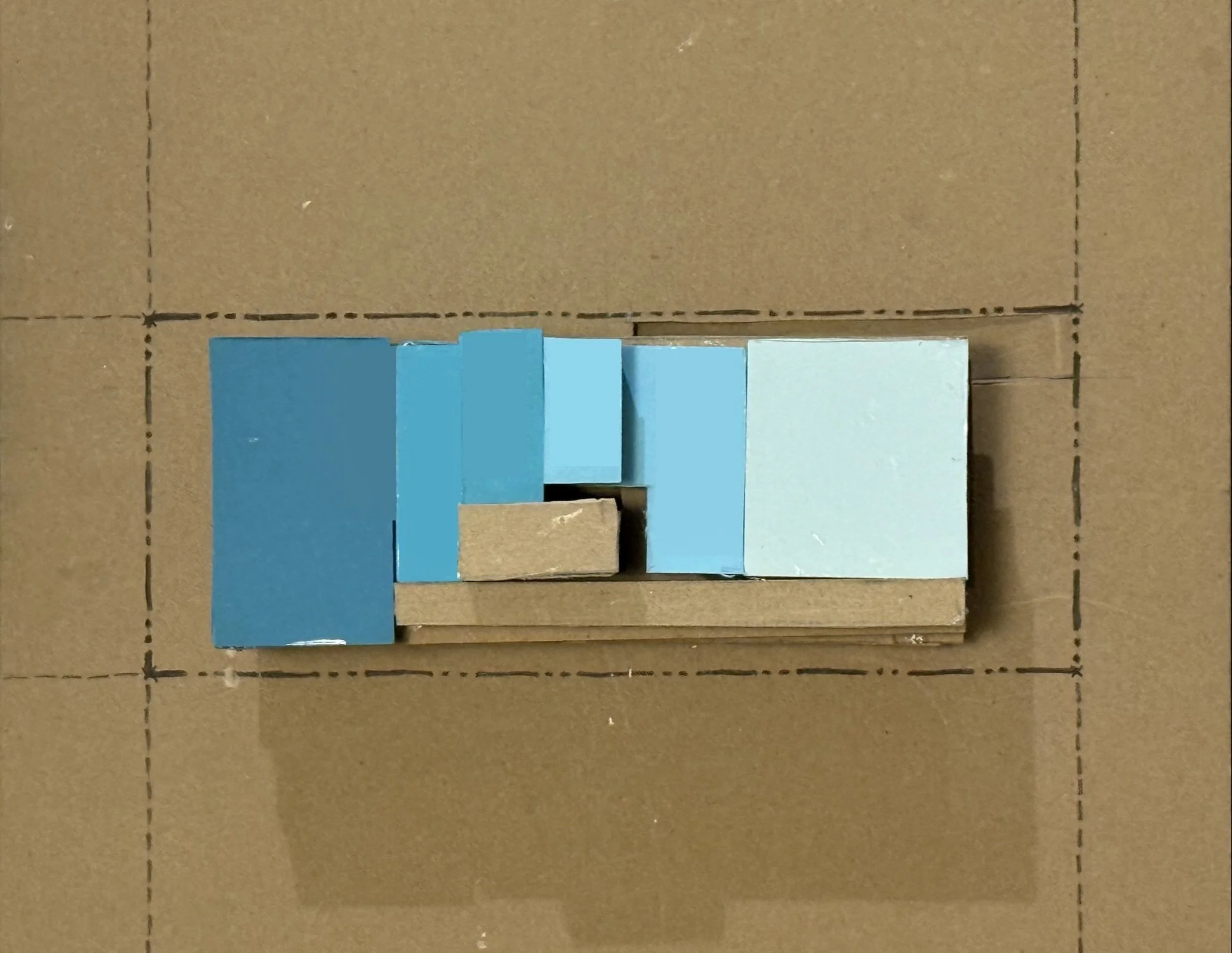
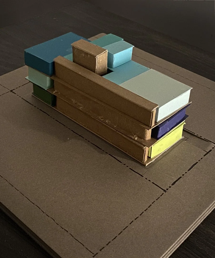
This is where the spatial organization and the form described by the programming model begins to be articulated and developed further.
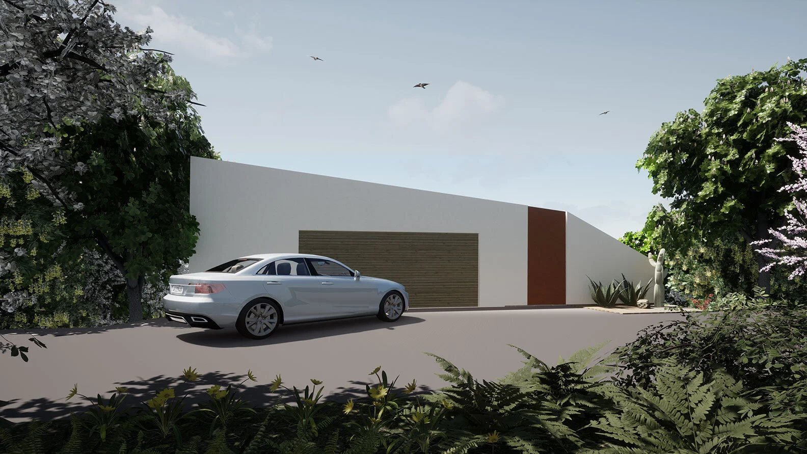
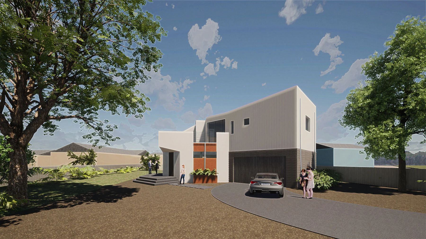
Like most houses that are accessed from the higher side of a steep hill, it displays a small, unsuspecting piece of building from the entry.
The process of entry walks the inhabitant through the roof deck. From the rear, the house appears to be a sculpted habitable form with large glass apertures.
The distribution of the spaces across three stories without an elevator probably lends itself to a particular type of buyer. (Our client is a developer, not the end-user.)
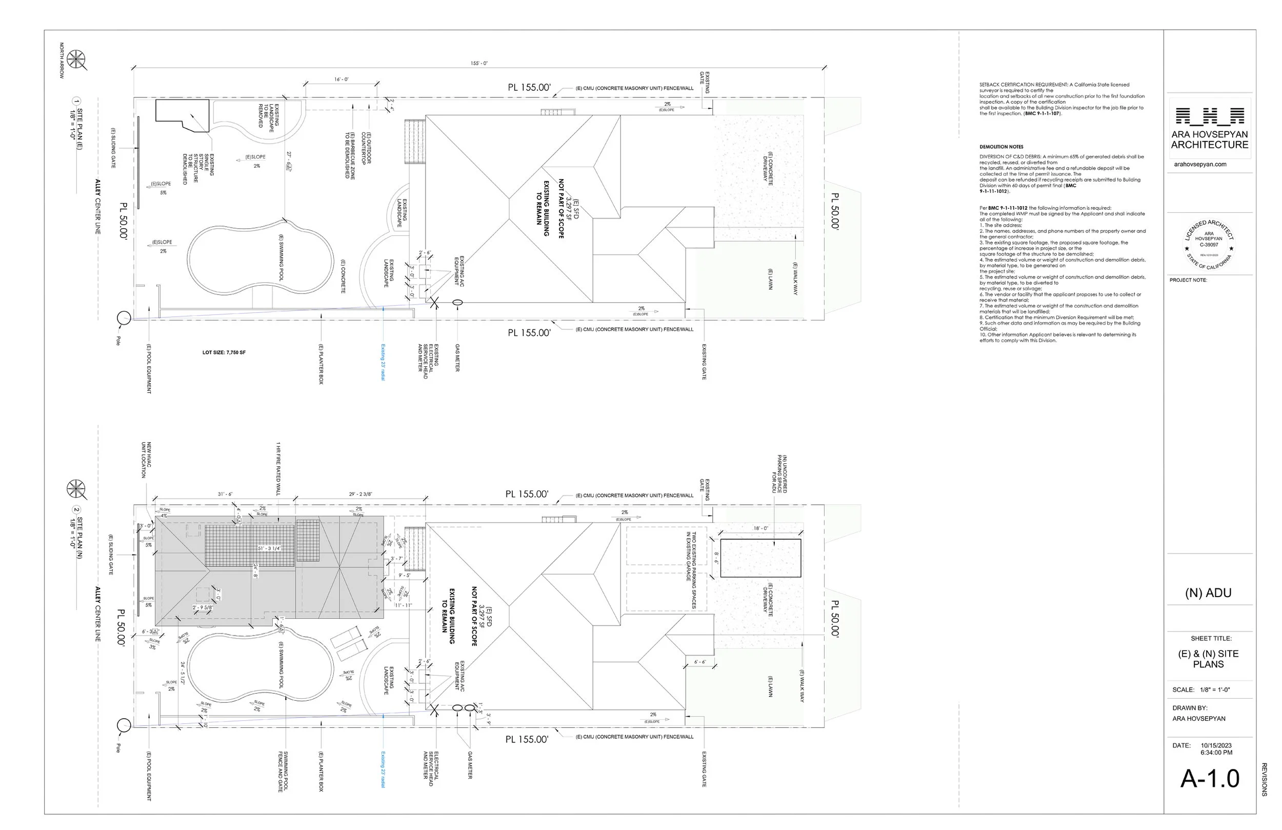
This project just got approved! This is our, and our client’s, take on California’s popular detached Accessory Dwelling Unit.
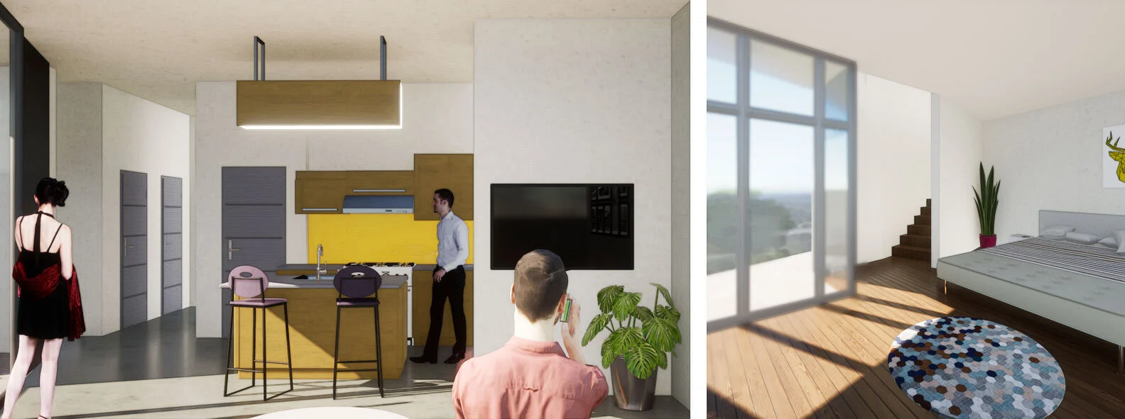
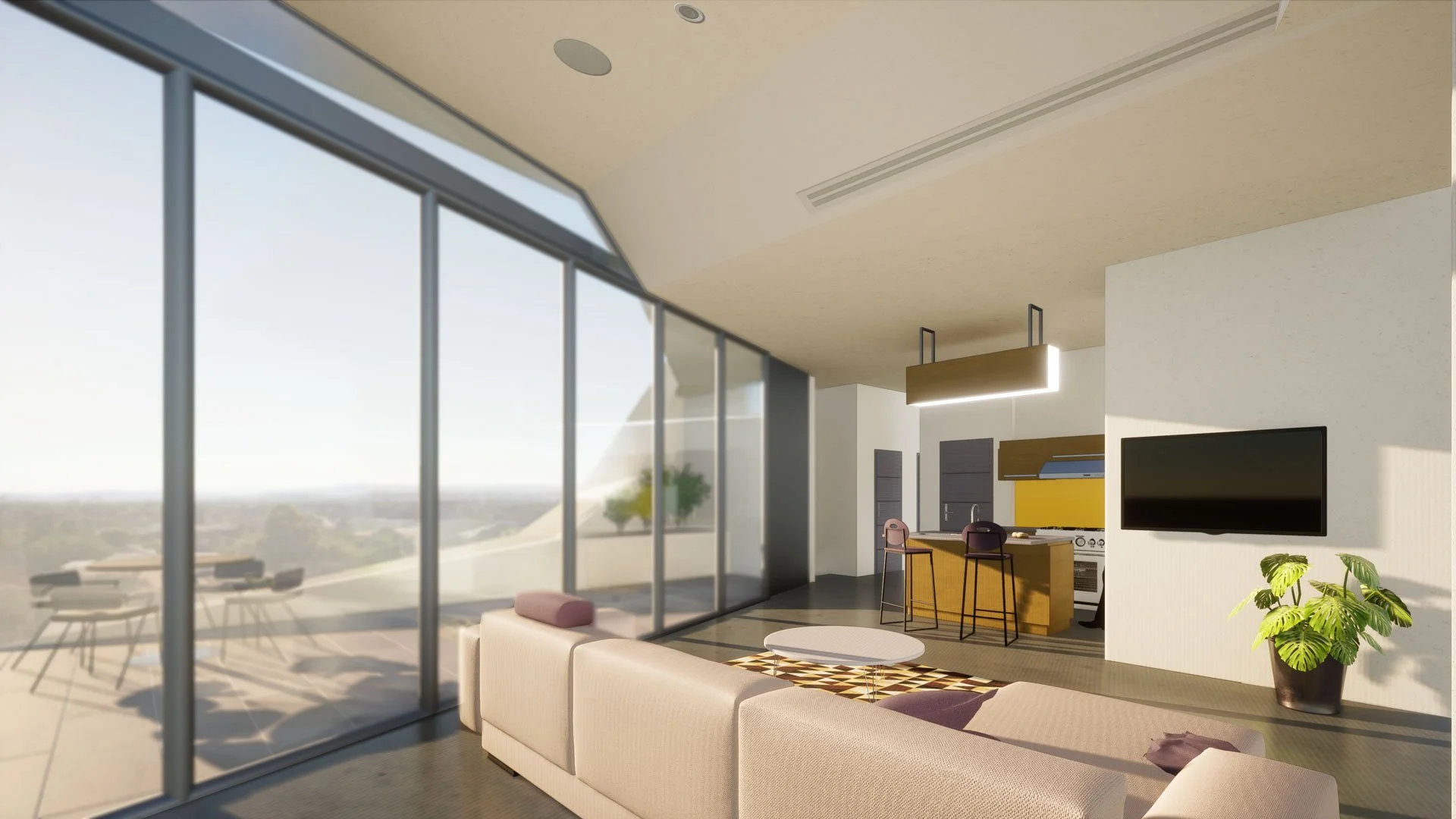
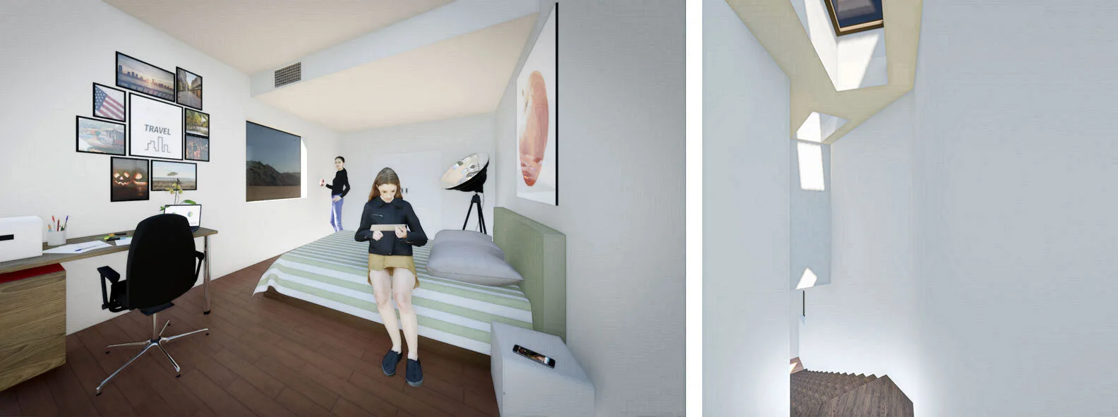
The first floor contains a living / dining / kitchen space and a garage, and the second floor contains two bedrooms.
The large site allowed us to explore various forms, and ultimately select this bend to arrange the program of the ADU along.
We use the raised foundation to create a sense of podium under the entry.
Skylights are placed to add more daylight to both stories.
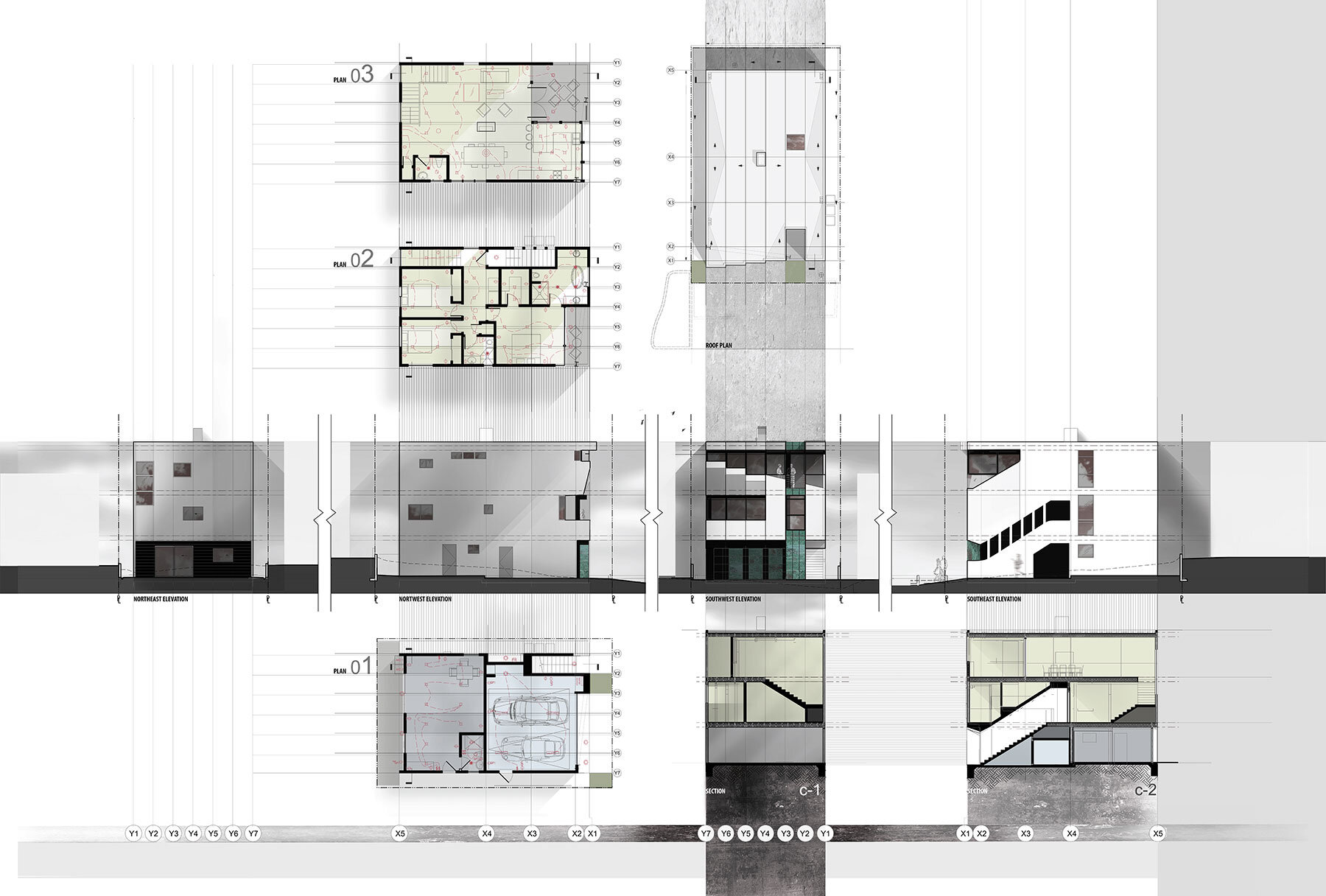
With this house, I wanted to compel both the viewer from the outside and the inhabitant within to look at the house through the eyes of the architect. What I ended up doing was embedding the grid lines I had set up in the drawing, into the architecture by having them articulate throughout the building. The lines can be read continuously as a reveal or an edge of a door or window element, from both the exterior and interior, with the exception of a few glitches.
Considering flooding risks, the more heavily used spaces (bedrooms, living, dining and kitchen) are placed on the second and third floors, leaving the first floor with parking and guest quarters.
Structure Reveal to Skin Reveal
Context
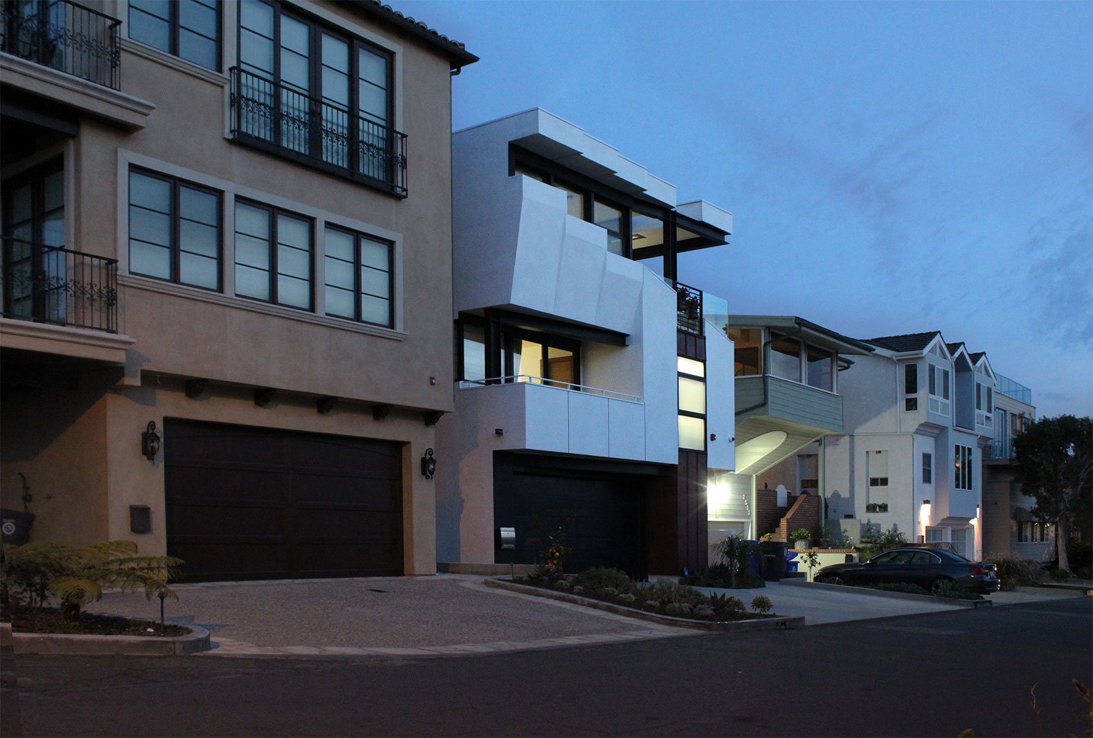
Angled cuts and overhangs are used to frame views while shading the southern sun.
Like Ay D, You? the site for this project is within the R-A (Residential Agricultural) Zone. This one is in Granada Hills, CA.
The first floor contains the living, dining, and kitchen spaces, along with one bedroom and a two car garage, and the second floor contains four bedrooms and a laundry room. The roof also acts as a habitable deck.
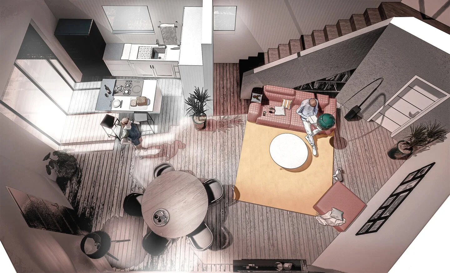
The open to below feature creates a double-height space and encourages more interaction within the home.
Context
The front, North-facing, elevation breaks down the mass to visually manageable parts. The rear, South-facing elevation contains formal extensions for built-in blocking of the harshest summer sun, over more than half of the rear glazing.
Both the main entry and rear entry frame the double-height space as a portal of sorts.
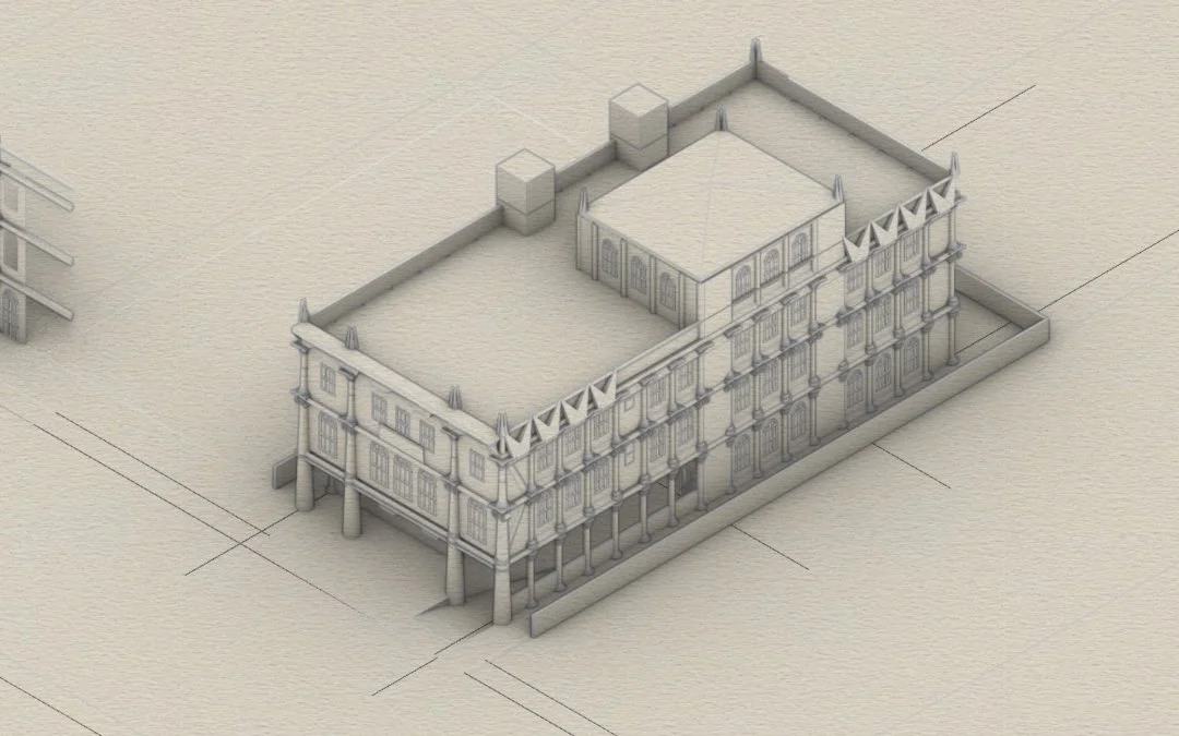
The house number for this project happened to be 1984, and shared the number with the title of the novel by George Orwell while I was working on the project during the global pandemic of 2020. The number come across my desk while people drawing similarities between the book and the times. When it became clear that this project wasn’t going to be constructed, it compelled me to title the project with the number. Not that I think this is some dystopian reality because of the fact that most architects’ designed buildings don’t end up being realized. The mystery of unbuilt work does have its own captivating nature in a way. More is left to the imagination. (And the model can be shifted from image to image as the architect sees fit.)
The program is arranged to minimize cutting and filling of site soil.
These are Rhino screenshots. This design was killed pretty early, but it’s going to live in my portfolio! It might inform a future project.
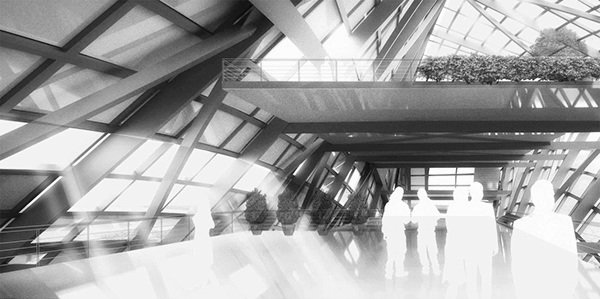
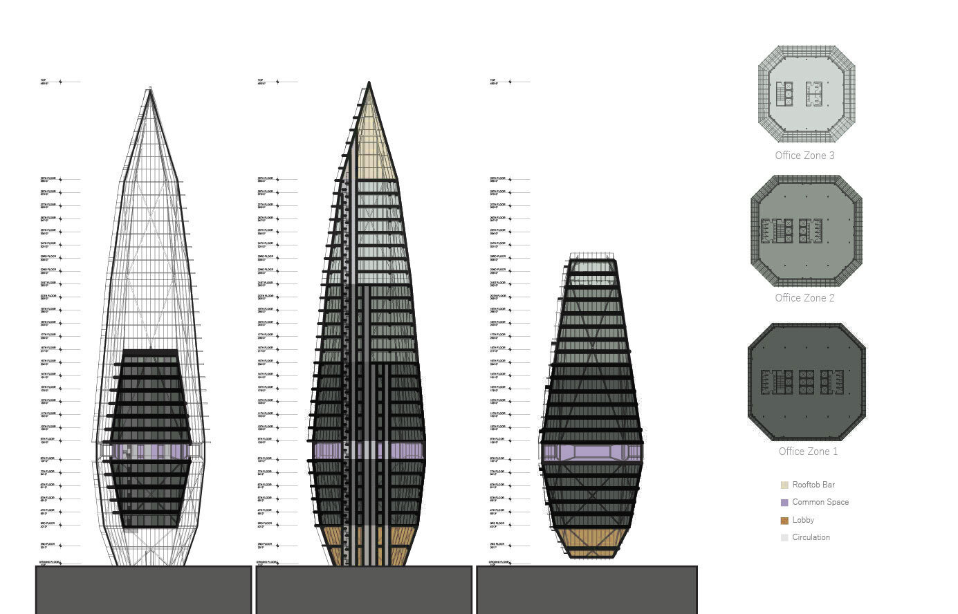
Our first prototype for a high-rise office building
The large bevels create a distinct sense of space within and a distinctive envelope from the exterior.
The varying floor widths make for a slightly different experience on each floor of the building.
Four facade strategies are incorporated and placed in order to minimize unwanted heat and maximize natural daylighting.
This work was done in the programming phase, before site selection, in order to assist the client with site selection.
described through Small, Medium, and Large options
A look at a potential organizational strategy of a community center between small and medium
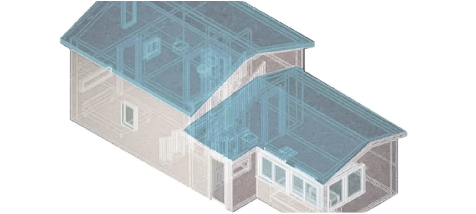
We designed and permitted this bathroom addition in 2017. The space is now being rented through Airbnb with its own restroom. The owner of the property lives on the floor above.
Before the addition we designed, the grey area within the walls didn’t contain a finished floor, but loose soil. We designed the platform to contain the new restroom and a closet. Since the completion of construction, the client has been monetizing the space through Airbnb.
Collaborative Project
Ara Hovsepyan + Arthur Badalian
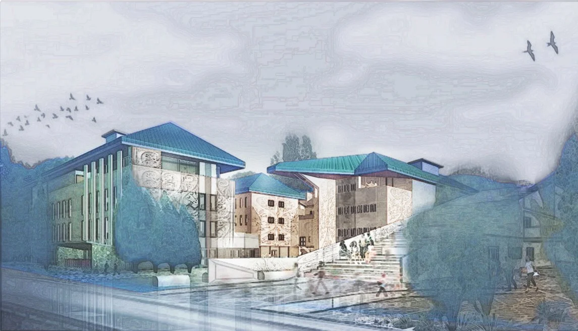
We designed the Blue Clay Spa for inhabitants to spend a few leisurely days enjoying its expansive guest house and experience the healing qualities of Blue Cay. Its rammed-earth walls, also composed of clay, as well as sand and gravel, maintain the tranquility of its context while sustaining their thermally massive and durable properties known to last centuries. Accommodations, which include baths, therapy rooms, sauna and massage rooms, are surrounded by the green nature that Latvia is known for. A second roof connects the disjoined structures of guest house, spa, dining, and service quarters to maximize the comfort of traveling between during months of snow, while collecting solar energy and guiding rainwater into cisterns.
Columbia University. 2012
Mojdeh Baratloo, Lee Altman, Justin Garrett Moore
Collaborative Project: Ara Hovsepyan, Andy Golubitsky, Kyung Sun Park, Rod Shahbazi
Red Hook’s once vibrant and active working waterfront was rendered nearly useless with the advent of containerization. With an increasing number of storms and hurricanes that flood the entire site, its potential for growth of local businesses and future development also diminishes. Today, the water’s edge is being used by “anchor tenants” such as Ikea, Fairway Market, and Brooklyn Cruise Terminal, serving a socioeconomic demographic that is foreign to the immediate site.
The current residents of Red Hook have thriving new neighbors yet receive little outside economic activity. Currently, the regional and international visitors only pass through the town to these three destinations, or overlook Red Hook completely. With ‘The Hook’, proposed commercial and green corridors, visitors, including Brooklyn cruise terminal users, can be linked to the rest of Red Hook, generating revenue and creating employment for the local community.
This new urban political and infrastructural system begins to share resources, transportation and human capital among the new commercial tenants, visitors, and the existing residents, while mediating the inevitability of the rising water levels and storm surges.
Woodbury University
2010
Professor: Clark Stevens
Team: Ara Hovsepyan & Arthur Badalian
The goal of this studio was to create simple, ecologically sound, culturally and aesthetically appropriate homesteads on rural properties. A $ 50,000 budget immensely confined our square footage and use of materials. Looking for building materials that we could attain for a relatively low cost, we came across the sturdy and readily available wooden pallet, typically used to support goods as they’re transported. Here, the pallets are used as modules to construct flooring with integrated beams and walls with reinforcing structure. Pallets are simple to assemble, and each one contains an inner cavity that we propose to fill with various elements imperative to inhabitation in this wilderness, such as insulation and structure. With just enough to meet the habitation needs for future ranch owners in Little Wood, Idaho, the cabin celebrates its context. For the outdoor enthusiast, there is no need to build extensive improvements that are wasteful and high impact. The cabin provides extra insulation on the west wall with stored fire logs, a view of the North Star (Polaris) from the sleeping quarters through the large angled aperture, a food preparation surface, full bathroom, and a solar panel to power the few lighting fixtures.
Columbia University, 2012
Skye Duncan
Collaborative Project: Ara Hovsepyan, Wang Gu, Scott Archer
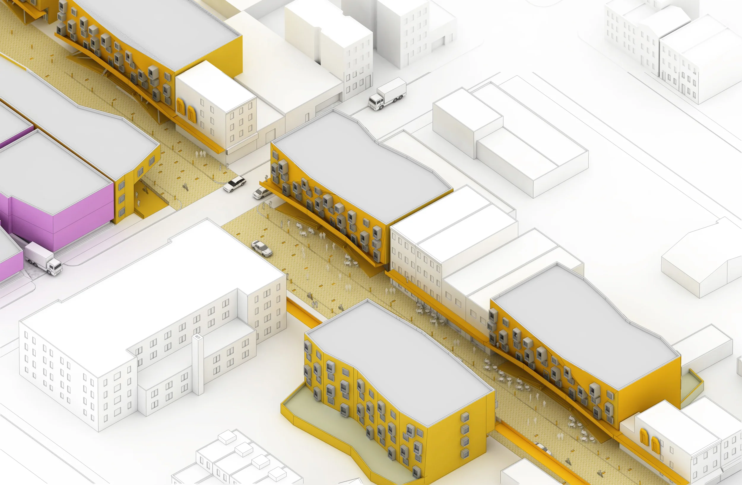
The senior population of NYC is expected to grow from 12% in 2008 to 20% in 2030. The redesign of the urban fabric of Manhattan, with the Two Bridges neighborhood as a case study, will provide this rapidly growing elderly population with a safer and more comfortable environment to age in place. New housing, transit connections, an accessible waterfront, and an integrated path network provide a framework in which the future populations can continue to use Two Bridges as a place of social interaction and graceful aging.
The project includes the following:
Transit Station: accessible subway station with connections to the B & N lines as well as the East River Ferry system
New Housing: mixed age group, micro-unit housing with shared spaces for social interaction & efficiency in housing floor area
Accessible Path Network: with rest areas of no greater than 1/8th mile apart to extend the distance the elderly population can walk
@ W.U. under Prof. Eric Olsen
Research & Design by Ara Hovsepyan
The proposal Investigates the Artibonite River valley, as Haiti’s most problematic and symbolic river region. Of Haiti’s ten departments, Artibonite has reported the most cases of and deaths from cholera, which is a fleeting problem, but the outbreak has exposed a substantial vulnerability, which arises from many Haitians drinking untreated river water.
Peripheral Cup claims a link between water diversion and urbanization and agriculture. The project takes the form of a linear city, incorporating a series of water collection, treatment, and storage facilities, which reach the intervention areas of the residents through copper distribution pipes. The water collection begins by defining reservoirs, and creating shedding structures with great surface area, which in the future will become roof structures for schools and hotels. We know this is fit for Haiti because only a few hundred miles away we find the Dominican Republic, where resorts are filled with European and North American tourists. But after studying the Caribbean, it becomes apparent that the other islands’ natural and historical heritages pale in comparison with Haiti’s. And schools would be fit as the cycle of poverty causes people to not spend money on their children’s education, and peasants routinely become victims of crooked lawyers taking advantage of their inability to read land titles.
Much value is placed on found site situations as the architecture adjusts to the land formation, considering flood plains and housing clusters, and anticipating growth. After the recent destruction in Puerto Prince, much of its population has relocated throughout Haiti. More Haitains relocated to Artibonite than any other department in the country. The intervention occurs in the form of communal shower areas, potable water distribution, and communal restrooms stemming from the water catchment and storage. The proposal deals with the essentials (nourishment) first and eventually fulfills the tourism and education potentials. A 12 inch copper pipe carries the treated water from the source, an 8 inch copper pipe carries it through the city, and 2 inch copper pipes ultimately distribute the water. The pipes are exposed as earthquakes would damage underground pipes.
Haiti’s large industrious population does not benefit from it’s government; education, health care, infrastructure maintenance, and disaster relief are all either lacking or assumed by NGOs. Haiti is a country that gets virtually nothing from its government; restricting the government’s role would not be detrimental to the services, and would decrease the cost.
INTERTWINED
Twisting/Untwisting Post Traumatic Stress and Steel
Collaborative Project: Ara Hovsepyan and Artur Nesterenko
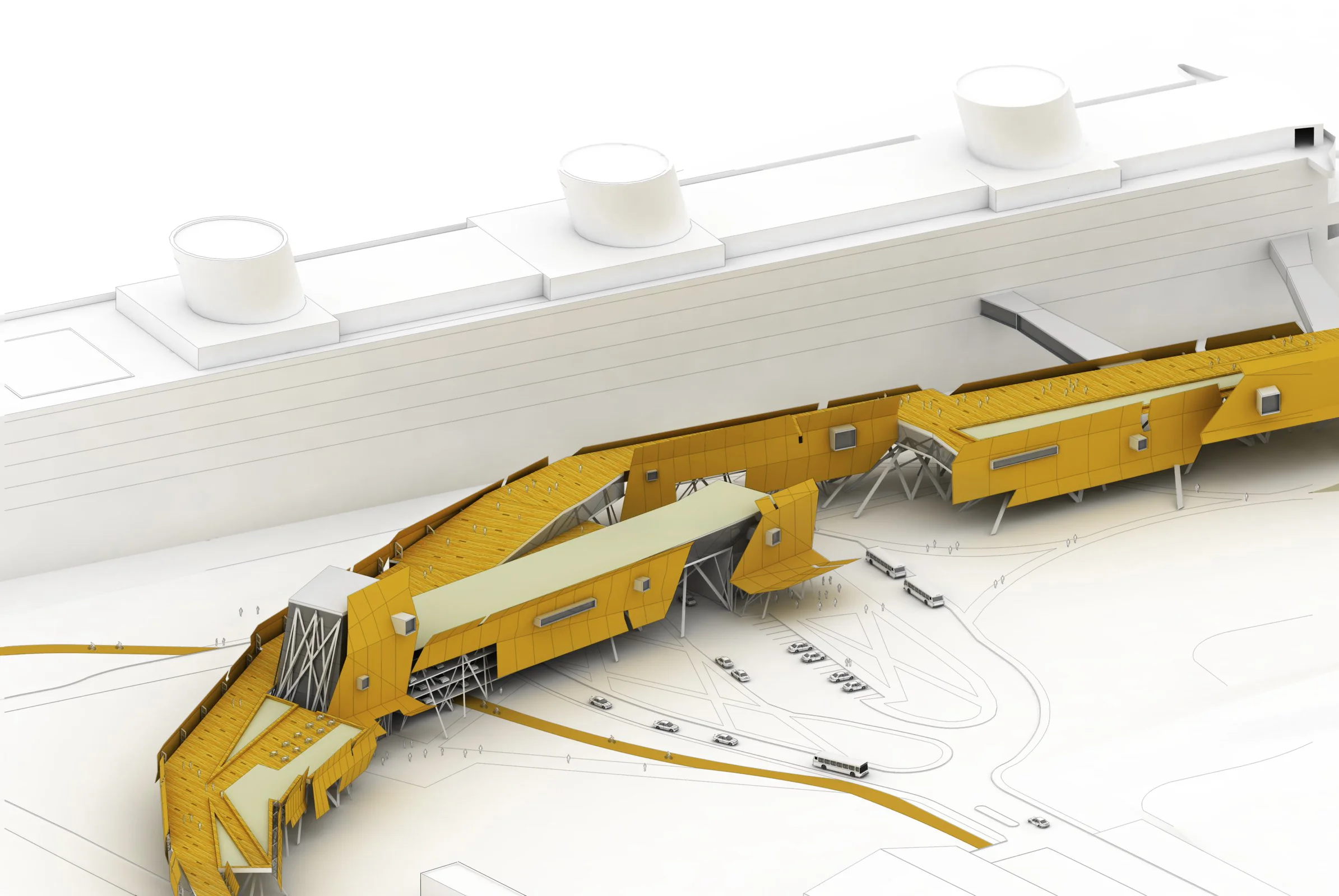
The Ballona Wetlands, located in Southern California, is one of the fewremaining wetlands of the Los Angeles area, yet it continues to decrease in size dueto urban development. The area of natural land has been reduced by thousands ofsquare acres due to construction within the past 70 years. The PTSD treatmentcenter will be lifted above the wetlands to preserve the land by its bending nature.This makes for a building that only makes contact with the ground at two pointsand strengthens the structure by forming an arch. The twist of the structure makesit a spectacle from the freeway and raises awareness of post-traumatic stress, whilerepresenting a metaphysical twist in the victims of PTSD and the building twistingthem back into shape.
Steel as a building material represents the most contemporary in architecture,and allows for curved surfaces and long spans. The building serves as a retreatfrom the harshness of the city and creates a place of meditation in the heart of thewetlands. By being secluded and separated, it allows for peaceful reflection andreconnection with self. The journey through the building and the surroundingnature guides one to his or her true nature. Living in our modern times is a stressfulendeavor and leaves one with no time to spare. The treatment center will encouragethe people inhabiting it to spend time reflecting and breaking away from theunhealthy habits that have become widely accepted in our society.
Collaborative Project
Ara Hovsepyan + Arthur Badalian
We use the A-frame as it allows for the creation of an architectural form with fewer surfaces than usual, simplifying the construction process. This form contains a steep angle on either side, providing large surfaces ideal for solar panels that can be used differently for different locations, and that will shed snow and water. The cabin is lifted off of the ground to minimize its penetrating footprint. Either stairs or a ramp can be attached to the platform.
The interior provides flexible space, in which tables can rotate and create different combinations of floor plans. Hay is used between the wood ribs for its high insulation value and spatial quality. Cabin A provides sleeping areas for up to 10 people (six below, and four on the mezzanine), composting, a storage area, rainwater collection, a kitchen, and a fireplace for both interior warmth and cooking.
We plan for a crew of a few people, enthusiasts, to be able to camp out for approximately one week to assemble Cabin A without heavy equipment.
The lucid dream is a dream in which the dreamer is aware that he or she is dreaming. A misleading name for this is a conscious dream, as one is conscious during all dreams. The difference is that the dreamer typically mistakes the dream for reality. One of the most common tells of lucid dreaming is having the wrong number of fingers on one’s hands. Others include being able to breathe with one’s nose plugged, unaided flight, clocks displaying strange symbols, and other illegible text.
We know from some obscure writings that Salvador Dali left behind that he dabbled in this deep pondering of the dream world. He tried to use the lucid dream in a way to achieve the sleeping of the brain, but the waking of the hand. It is a self-induced variation of sleep walking with aspects of lucidity. He famously said ‘I don’t do drugs, I am drugs,’ escaping from the inebriated image of the prolific artist while drawing inspiration from the depths of his conscious/subconscious through this natural phenomenon of the dream world. I chose to paint, more as an illustrator of experiences I had in dreams than an author, to set my intention for further lucid dreaming.